
Brand
NutriBiologic
Restore · Rebuild · Replenish
This is the visual identity behind nutribiologic.com — the mark, the two colour palettes, the type, and the standards each one is held to. Every value on this page is read from the site's own stylesheet, so what you see here is what the site is actually using.
46
Colours in the system
40
Pairings measured
38 / 38
Legibility requirements met
4.64:1
Lowest contrast of any text
The mark
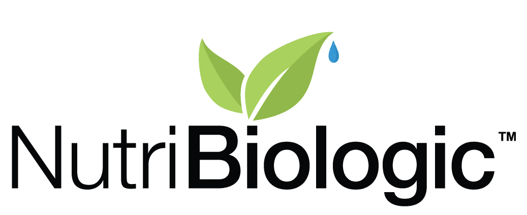
Two leaves and a droplet, beside a wordmark that splits its own name — Nutri light, Biologic bold. The greens are fixed values, not a filter over the photography, and they are where the rest of the palette comes from.
On the page
On a tinted section
On the footer
There is no reversed version. The wordmark is near-black and disappears against a dark ground, which is why the footer carries the name as type rather than as the mark.
- Clear space
- Keep space equal to the height of the droplet on all four sides — about 12px at the size the header uses.
- Minimum size
- 104 × 42px. Below that the two leaves merge into one shape and the droplet closes up. The original artwork is 1037 × 423.
- Never
- Stretch it, recolour the leaves, or add a shadow or an outline. If it needs to sit on a busy photograph, give it a plain panel first.
Colour
Two complete palettes. Every colour is defined for a light page and again for a dark one, so nothing has to be improvised when the page inverts. Both are shown together below.
Action
Green means you can act on it. A single deep green carries every button and link across the site, so a button always looks like a button. The blue from the droplet in the logo is held back for focus outlines and informational links, where a second colour helps rather than competes.
Action green
--brand
Action green, hovered
--brand-hover
Text on action green
--brand-foreground
Quiet button
--soft-button
Text on a quiet button
--soft-button-foreground
Focus outline
--ring
Droplet blue
--droplet
Leaf greens
Taken directly from the leaf in the logo. The bright green is a background colour only — it is too light to set words in — so there is a darker green beside it for anything that has to be read.
Leaf
--leaf
Leaf, hovered
--leaf-dark
Deep leaf
--leaf-deep
Text on leaf
--leaf-ink
Leaf wash
--leaf-wash
Paper and ink
The greys the site is printed on. Each one carries a trace of green, so a page feels of a piece with the logo rather than assembled from someone else's defaults.
Page
--background
Body text
--foreground
Card
--card
Text on a card
--card-foreground
Popover
--popover
Text in a popover
--popover-foreground
Tinted section
--secondary
Text on a tinted section
--secondary-foreground
Muted panel
--muted
Secondary text
--muted-foreground
Accent panel
--accent
Text on an accent panel
--accent-foreground
Lines
Two greys that look alike and are held to different standards. One only separates blocks of content. The other draws the edge of a box you have to find and type into, so it has to be visible enough to find.
Divider
--border
Field edge
--input
Header and footer
The slim bar above the navigation and the footer at the foot of every page. In dark mode the footer goes darker than the page rather than lighter, so it still reads as the edge of things.
Utility bar
--topbar
Utility bar text
--topbar-foreground
Footer
--footer
Footer text
--footer-foreground
Warnings
The only colour here that isn't green. It is reserved for things that have gone wrong — a form that needs another look, a payment that did not go through — so it never loses its meaning through overuse.
Error red
--destructive
Defaults
The names the site's off-the-shelf interface components reach for. They point at the greens above, so anything added later arrives on-brand without being restyled first.
Primary
--primary
Text on primary
--primary-foreground
Also defined, not yet used
5 × --chart-… — A graded green ramp, held for charts. Nothing on the site draws one yet.
8 × --sidebar… — A sidebar set that ships with the component library. This site has no sidebar.
Legibility
A palette is only worth as much as the words that survive it. Every combination the site actually puts on screen is listed here and measured against WCAG 2.1, the international standard for readable contrast. These are measurements, not intentions — the numbers are calculated from the colours themselves each time this page is built.
Text has to reach 4.5:1; AA is the pass, AAA is comfortably past it. The edge of a control you have to find has to reach 3:1. A rule that only separates two blocks of content has no requirement at all, and is marked as such rather than left blank.
| Where it appears | Light | Dark |
|---|---|---|
| Body and heading copy--foreground on --background | 16.35:1AAA | 16.37:1AAA |
| Secondary copy, meta, captions--muted-foreground on --background | 5.98:1AA | 7.77:1AAA |
| Prices and text links--brand on --background | 7.36:1AAA | 10.31:1AAA |
| Informational links--droplet on --background | 5.25:1AA | 7.91:1AAA |
| Form and checkout errors--destructive on --background | 4.64:1AA | 6.33:1AA |
| Muted sections, the hero panel--foreground on --secondary | 15.39:1AAA | 14.21:1AAA |
| Meta inside muted sections--muted-foreground on --secondary | 5.63:1AA | 6.75:1AA |
| Spotlight specs, order summary--card-foreground on --card | 16.80:1AAA | 14.86:1AAA |
| Add to cart, Shop now--brand-foreground on --brand | 7.56:1AAA | 10.31:1AAA |
| The same buttons, hovered--brand-foreground on --brand-hover | 9.78:1AAA | 12.01:1AAA |
| Clear filters, secondary actions--soft-button-foreground on --soft-button | 6.63:1AA | 10.74:1AAA |
| Added confirmation, selected option--leaf-ink on --leaf | 9.46:1AAA | 10.31:1AAA |
| The same, hovered--leaf-ink on --leaf-dark | 7.31:1AAA | 7.97:1AAA |
| Tinted grounds, hovered filter pills--leaf-deep on --leaf-wash | 6.93:1AA | 7.14:1AAA |
| Utility bar above the header--topbar-foreground on --topbar | 6.81:1AA | 7.05:1AAA |
| Footer copy and links--footer-foreground on --footer | 13.38:1AAA | 12.18:1AAA |
| Focus ring on every control--ring on --background | 7.36:1Meets 3:1 | 10.31:1Meets 3:1 |
| Edge of a text field or dropdown--input on --background | 3.28:1Meets 3:1 | 3.57:1Meets 3:1 |
| The same fields inside a tinted section--input on --secondary | 3.09:1Meets 3:1 | 3.50:1Meets 3:1 |
| Hairlines between blocks of content--border on --background | 1.22:1No minimum | 1.40:1No minimum |
Type
One family throughout: Helvetica, falling back to Arial. It is the face the wordmark itself is set in, so the page and the logo speak with one voice. Nothing is downloaded — the type is already on the device, which is part of why pages arrive as quickly as they do.
| Role | Size | Line height | Weight | Tracking | Where |
|---|---|---|---|---|---|
| Display | 36px | 40px | 600 | -0.022em | Page and hero headings |
| Section | 30px | 36px | 600 | -0.018em | Section headings |
| Subsection | 24px | 32px | 600 | -0.011em | Description, You may also like |
| Card title | 18px | 28px | 600 | -0.005em | Promise cards, order summary |
| Body | 16px | 24px | 400 | — | Running copy, product names, legal |
| Small | 14px | 20px | 400 | — | Prices, breadcrumbs, footer |
| Micro | 12px | 16px | 500 | — | Badges, labels, the utility bar |
Helvetica sets wide, so the larger sizes are tracked tighter to close the gaps between letters, easing back to normal by the time text is small enough that tightening would cost legibility.
Shape and surface
Corners come from one number — 0.375rem — scaled up and down. Buttons are flat: no shadow, no gradient, and nothing lifts or moves on hover. Colour alone carries the change of state, which keeps the page still while you read it.
3.6px
4.8px
6px
8.4px
10.8px
13.2px
15.6px
In use
The same controls in both palettes. The dark half is a live rendering, not a mock-up — it is the identical markup with the dark palette applied.
light
Tab to the field to see the focus outline.
dark
Tab to the field to see the focus outline.
The dark palette is complete and measured to the same standard as the light one. The site ships in light today; the second is there so that switching it on is a decision rather than a project.